This post was originally published on kaapedev.wordpress.com.
The old blog is no longer actively maintained, but I’d still like to keep my old articles about game development with Xbox Live Indie Games.
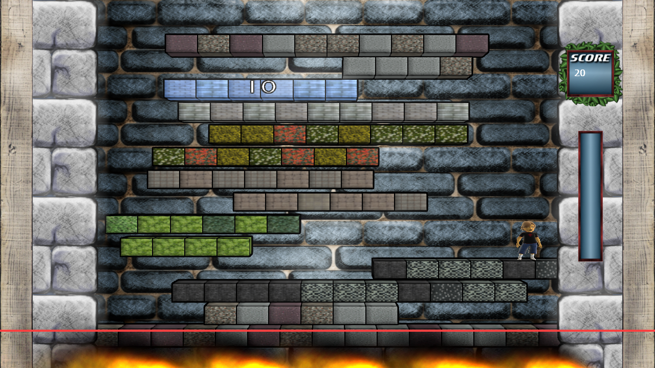
A lot of potential “platform theme” texture files have been lying around on my hard disk for some time now. All of them can be found on cgtextures.com which is my preferred resource for photorealistic seamless textures. Today I tested some of them on the platforms and really like the result of the comic shader.

You might also notice the leaves around the scoreboard. The borders between the HUD and the wall behind them are pretty harsh. I tried to weaken them by adding these leaves. They give a new touch to the graphic style that I will extend further to the combometer and also to the combo effect messages, that will pop up when the player finishes a combo.
The background is the only element in the game that I don’t like anymore. It doesn’t fit the rest of the screen. I’ll try to come up with a new design quickly.

